
This is a logo and treatment I designed for a new brand of HDMI cables. The name came from the double helix structure of DNA. The cables twist and turn, which in turn can reflect how DNA is constructed. The "X" on the logo is also representative of a chromosome and the protein "rungs" of DNA.

This is an unfolded layout of a window box with a magnetic cover that would house HDMI cables. I wanted the presentation to feel mysterious at first glance, but when the cover is opened, the viewer would be presented with vivid blue color and in turn, "Discover" the cables displayed inside.
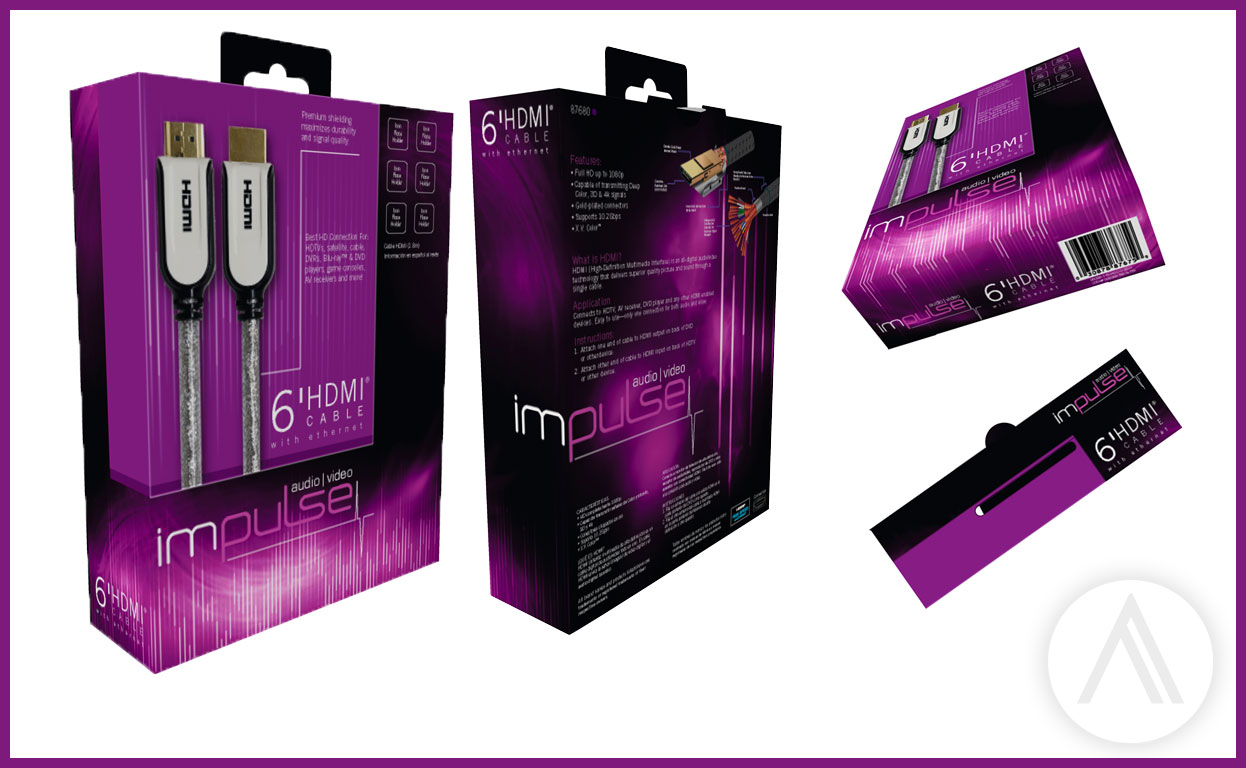
This is packaging and branding was designed for a new line of home theatre connectivity products. I used elements of audio spectrums and wave forms to create the technical elements on the packaging. Our client wanted something different, so I chose a strong magenta color to draw the eye to the product.

This project was created to help bring donations and support to Shielder Elementary School, an underprivileged local public school in Oklahoma city. In the spirt of "Thinking globally and acting locally", the project strove to provide new computers systems and safe and new playground equipment to the school.
The design on the left was my original pitch to the client. I wanted to illustrate the passing of time on cherished playground toys. And use the child's eyes to harbor hope and pull at your heart strings.
The final piece was a tri-fold brochure with pictures of the actual school and the children provided. I again tried to juxtapose the forgotten element of the school and playground with the reality the children are resilient and bright, and deserve support.
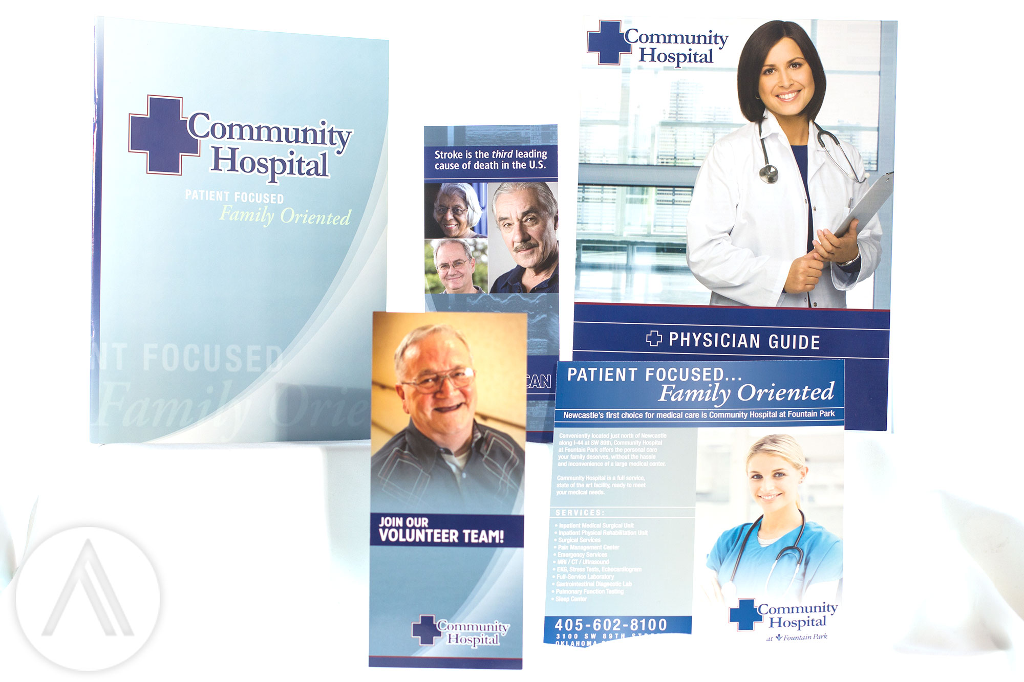
These projects were created for Community Hospital for their 2009-2010 re-branding campaign. I produced these for Liquid Media, a marketing group who specializes in medical marketing, throughout 2009.
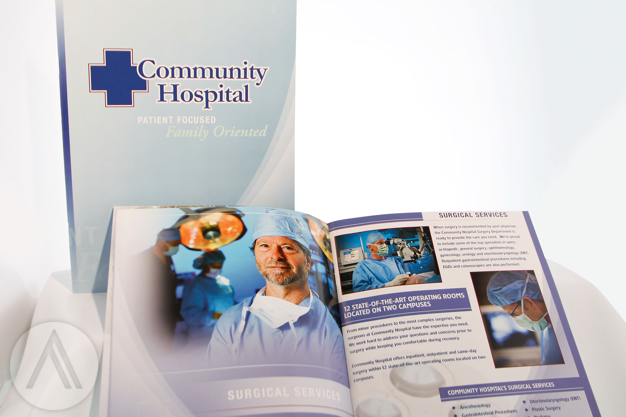
This was a 28 page catalog showcasing the "Patient Focus. Family Oriented", environment of Community Hospital. The photos used in this piece were shot by Liquid Media as we wanted to make this a real as possible with very little stock photography.
The challenging aspects of this project were making sure the layouts were correct so we did not loose elements in the gutters, and maintaining color consistency in the photos throughout the piece.

These ads were created for Metro Family, Tinker Take Off and Edmond Living magazines during 2003-2006. Lots of faces have come and gone at KFOR over the last decade. However, Kevin Ogle's "The Rant" is still a strong segment on the 10pm news and they still use the branding I created.

These are a couple of ads/direct mailers I created for Mountain States Toyota and Johnnies Express during my time at Skyline Media.
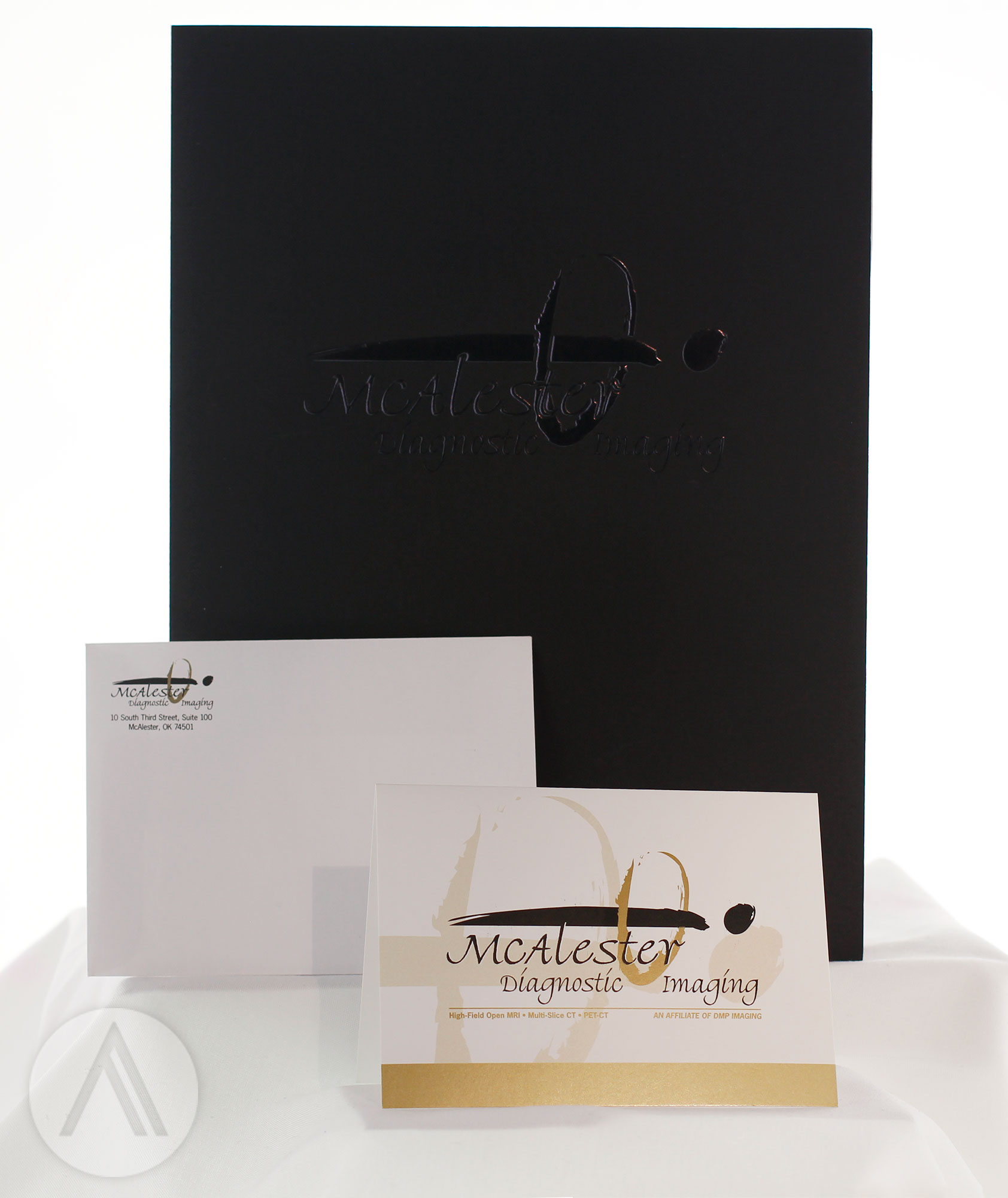
These are some pieces of office collateral I created for McAlester Diagnostic Imaging. Their logo is an extremely gestural look for a person going through a CAT Scan.
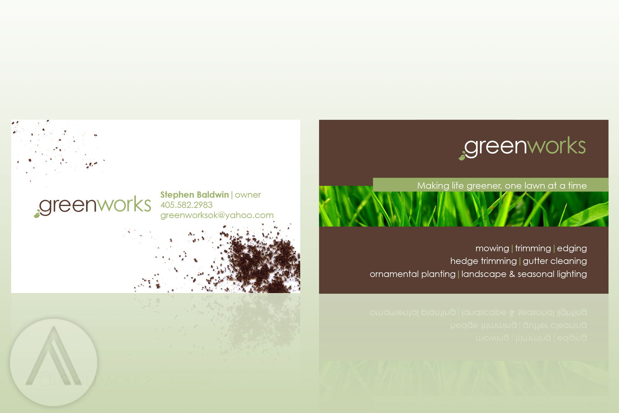
My client requested that the logo and business cards be different than your average lawn care branding. I broke down the message right down to dirt itself. (I created the dirt on the left with used coffee grounds) I wanted the design to have a fresh clean look, similar to what a freshly cut lawn looks and smells like. I also encouraged the client to go with an environmentally-friendly recycled paper stock for the printing.

Strength, honor, nurturing, beauty- the textures of tradition. I wanted to capture all of this in these invitations.
Nature creates the most beautiful shapes and textures. The elements on the invitations were all taken from my family's farm. Leaves from a 100+ year old oak tree, sumac bushes and elm trees all came together to produce this piece. The script and scroll elements were hand stamped and then complied digitally to give it a tactile, hand made look.
I chose a linen paper stock to give weight to the inks and texture to the work. As a matter of fact, the invitations had to be individually laid out and cured for 3 days to make sure the colors set and dried properly. My printer people really went out of their way to make this piece shine.
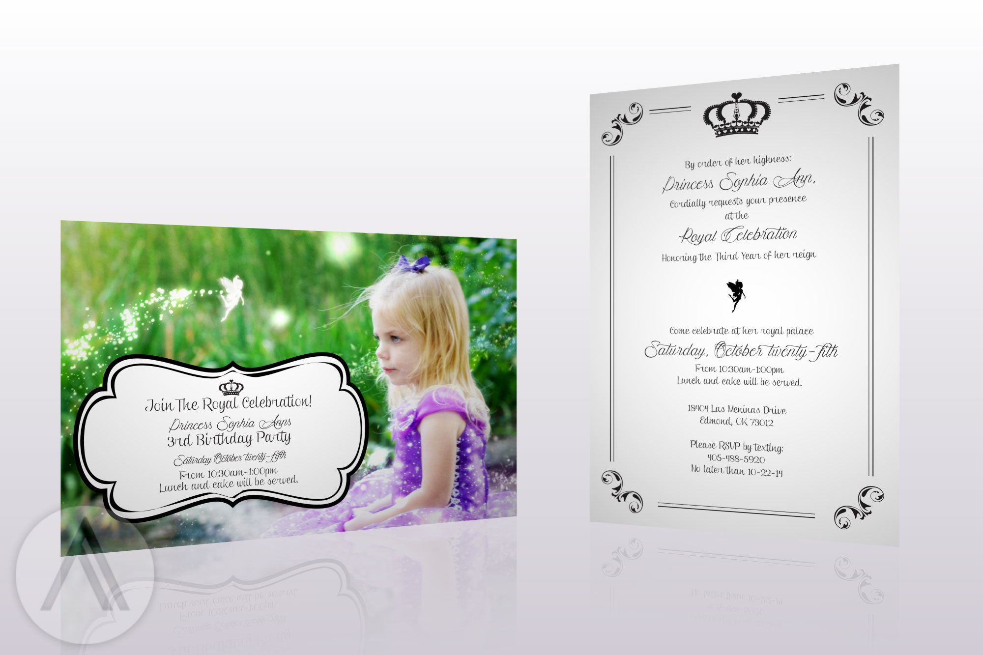
This piece was created for my daughter's 3rd birthday. I wanted to give it a sense of magic and whimsy. I created the fairy dust in After Effects and hand painted the fairy element. As far as the image goes, I used several methods to make the colors more vivid and dream like. Only the best for royalty!

This project was truly a labor of love for a couple of people close to my heart. Their wedding was fall themed, so I used a selection of leaf textures and watercolors to achieve the looks going on in these two pieces.
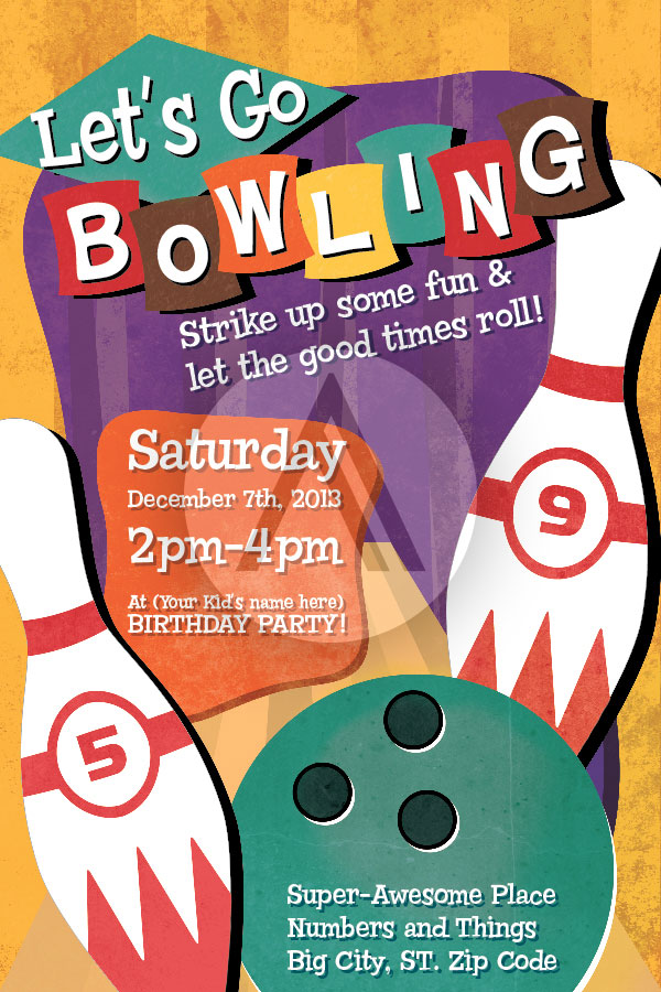
This was a fun invite I created for family member's birthday party. I wanted to keep a fun retro bowling alley / skating rink aesthetic. I really enjoy the color work on this piece.
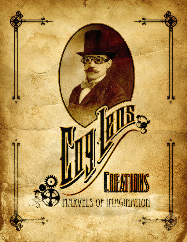
This piece was created for a client who has a steam punk prop business. He wanted a new identity for his Facebook page. I started by finding a vintage photo and manipulating it by adding a top hat and goggles and some lighting tweaks. All of the other elements are vectors.
I wanted some repetition in the design of this piece which I achieved through adding the gears and flourishes on the corners. Keeping a the gears aesthetic through the peice really connected all of the elements. Overall, I think Jules Verne would be proud.

This is a simplified look at the process of creating the steam guy. A little of this, a little of that and PRESTO!

This is generally what my Illustrator logo layouts look like. I find any swatches that I like and have them close by. For this project, I sampled the colors of an abandoned ship hull. I found a type face that I liked and started to manipulate it, keeping the vertical ratio of the final piece in mind. The curves and warps I try to keep on the same curvature.

This piece was for a branding and T-Shirt design for the OAFC Facebook group. I'm partial to giant robots, so I really enjoyed designing this guy. As most of the group members enjoy comics, I wanted to pay tribute to the books themselves by selecting type treatments that reflected the "BAM!", "BOOM!" and "POW!" of the vintage comics. I also like using the half-tone patterns throughout this piece.


This is a logo and treatment I designed for a new brand of HDMI cables. The name came from the double helix structure of DNA. The cables twist and turn, which in turn can reflect how DNA is constructed. The "X" on the logo is also representative of a chromosome and the protein "rungs" of DNA.
This is an unfolded layout of a window box with a magnetic cover that would house HDMI cables. I wanted the presentation to feel mysterious at first glance, but when the cover is opened, the viewer would be presented with vivid blue color and in turn, "Discover" the cables displayed inside.
This is packaging and branding was designed for a new line of home theatre connectivity products. I used elements of audio spectrums and wave forms to create the technical elements on the packaging. Our client wanted something different, so I chose a strong magenta color to draw the eye to the product.
This project was created to help bring donations and support to Shielder Elementary School, an underprivileged local public school in Oklahoma city. In the spirt of "Thinking globally and acting locally", the project strove to provide new computers systems and safe and new playground equipment to the school.
The design on the left was my original pitch to the client. I wanted to illustrate the passing of time on cherished playground toys. And use the child's eyes to harbor hope and pull at your heart strings.
The final piece was a tri-fold brochure with pictures of the actual school and the children provided. I again tried to juxtapose the forgotten element of the school and playground with the reality the children are resilient and bright, and deserve support.
These projects were created for Community Hospital for their 2009-2010 re-branding campaign. I produced these for Liquid Media, a marketing group who specializes in medical marketing, throughout 2009.
This was a 28 page catalog showcasing the "Patient Focus. Family Oriented", environment of Community Hospital. The photos used in this piece were shot by Liquid Media as we wanted to make this a real as possible with very little stock photography.
The challenging aspects of this project were making sure the layouts were correct so we did not loose elements in the gutters, and maintaining color consistency in the photos throughout the piece.
These ads were created for Metro Family, Tinker Take Off and Edmond Living magazines during 2003-2006. Lots of faces have come and gone at KFOR over the last decade. However, Kevin Ogle's "The Rant" is still a strong segment on the 10pm news and they still use the branding I created.
These are a couple of ads/direct mailers I created for Mountain States Toyota and Johnnies Express during my time at Skyline Media.
These are some pieces of office collateral I created for McAlester Diagnostic Imaging. Their logo is an extremely gestural look for a person going through a CAT Scan.
My client requested that the logo and business cards be different than your average lawn care branding. I broke down the message right down to dirt itself. (I created the dirt on the left with used coffee grounds) I wanted the design to have a fresh clean look, similar to what a freshly cut lawn looks and smells like. I also encouraged the client to go with an environmentally-friendly recycled paper stock for the printing.
Strength, honor, nurturing, beauty- the textures of tradition. I wanted to capture all of this in these invitations.
Nature creates the most beautiful shapes and textures. The elements on the invitations were all taken from my family's farm. Leaves from a 100+ year old oak tree, sumac bushes and elm trees all came together to produce this piece. The script and scroll elements were hand stamped and then complied digitally to give it a tactile, hand made look.
I chose a linen paper stock to give weight to the inks and texture to the work. As a matter of fact, the invitations had to be individually laid out and cured for 3 days to make sure the colors set and dried properly. My printer people really went out of their way to make this piece shine.
This piece was created for my daughter's 3rd birthday. I wanted to give it a sense of magic and whimsy. I created the fairy dust in After Effects and hand painted the fairy element. As far as the image goes, I used several methods to make the colors more vivid and dream like. Only the best for royalty!
This project was truly a labor of love for a couple of people close to my heart. Their wedding was fall themed, so I used a selection of leaf textures and watercolors to achieve the looks going on in these two pieces.
This was a fun invite I created for family member's birthday party. I wanted to keep a fun retro bowling alley / skating rink aesthetic. I really enjoy the color work on this piece.
This piece was created for a client who has a steam punk prop business. He wanted a new identity for his Facebook page. I started by finding a vintage photo and manipulating it by adding a top hat and goggles and some lighting tweaks. All of the other elements are vectors.
I wanted some repetition in the design of this piece which I achieved through adding the gears and flourishes on the corners. Keeping a the gears aesthetic through the peice really connected all of the elements. Overall, I think Jules Verne would be proud.
This is a simplified look at the process of creating the steam guy. A little of this, a little of that and PRESTO!
This is generally what my Illustrator logo layouts look like. I find any swatches that I like and have them close by. For this project, I sampled the colors of an abandoned ship hull. I found a type face that I liked and started to manipulate it, keeping the vertical ratio of the final piece in mind. The curves and warps I try to keep on the same curvature.
This piece was for a branding and T-Shirt design for the OAFC Facebook group. I'm partial to giant robots, so I really enjoyed designing this guy. As most of the group members enjoy comics, I wanted to pay tribute to the books themselves by selecting type treatments that reflected the "BAM!", "BOOM!" and "POW!" of the vintage comics. I also like using the half-tone patterns throughout this piece.